Robinhood

Robinhood

Timeline

3 months

Year

2026

Robinhood gives people a simple way to invest, move money, and manage their financial lives.

Robinhood gives people a simple way to invest, move money, and manage their financial lives.

The goal was to help Robinhood rapidly launch and learn from new incentive experiments, while making every offer feel simple, trustworthy, and consistent.

Timeline

3 months

Role

UX/UI Design

UX Research

Background

I joined Robinhood's Growth Incentives team, where the work doesn't look like a roadmap. Instead of one large feature over several months, I designed across a continuous stream of experiments: helping customers fund their accounts, transfer assets in, and find more of what the platform already offered them.

Each experiment tested a different hypothesis, audience, or reward structure. As one moved toward launch, the next was already in exploration.


Problem

An offer sounds simple on paper. Get a match on your transfer. The experience behind it never is.

Every experiment arrived with its own combination of eligibility rules, personalized rates, deadlines, holding requirements, reward math, legal disclosures, and product surfaces. All of it had to be understandable — without turning a promotion into a contract.

And the team had to keep moving. Designing each promotion from scratch would have slowed the pipeline to the speed of its slowest reviewer, and left customers with four different ways of being told the same thing.


Objective

Design a flexible incentive experience that could:

  • Launch and learn from experiments more quickly

  • Explain complicated promotional mechanics clearly

  • Build trust around eligibility, rewards, and deadlines

  • Reuse familiar patterns across different offers and surfaces

  • Support growth goals for funded accounts, deposits, and asset transfers
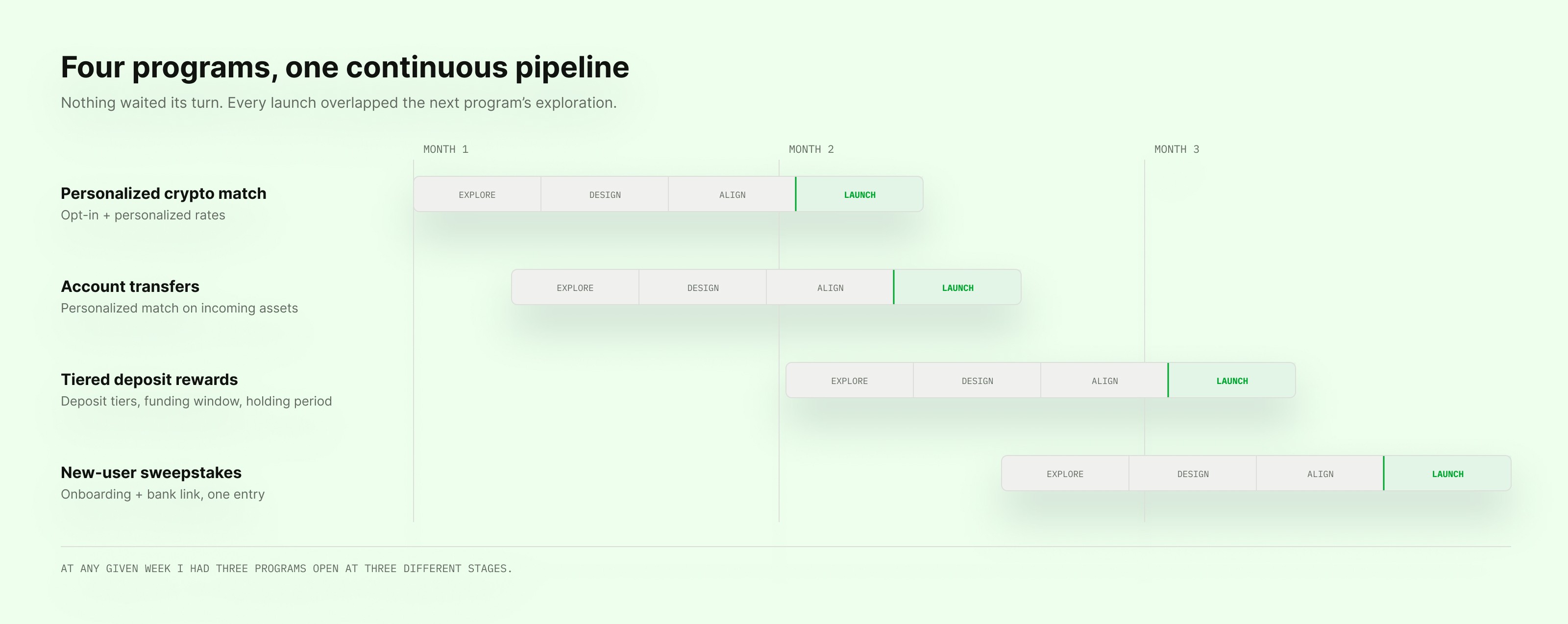


The pace was a little different from a normal product team. There was always another experiment right behind the one we were finishing.


Moving from one experiment straight into the next

The team ran a tight loop: form a hypothesis, design the experience, align partners, prepare for launch, read the results, feed them into the next one.

I usually had three programs open at three different stages. One might be in final compliance review while another was still an open question about how the offer should be structured at all.

That pace forced a specific discipline: decide quickly, but never at the expense of the person on the other side of the screen.


Every offer was different. The experience couldn't be.

Some customers were offered a personalized match rate. Others qualified by depositing a certain amount, transferring an account, linking a bank, or simply finishing onboarding.

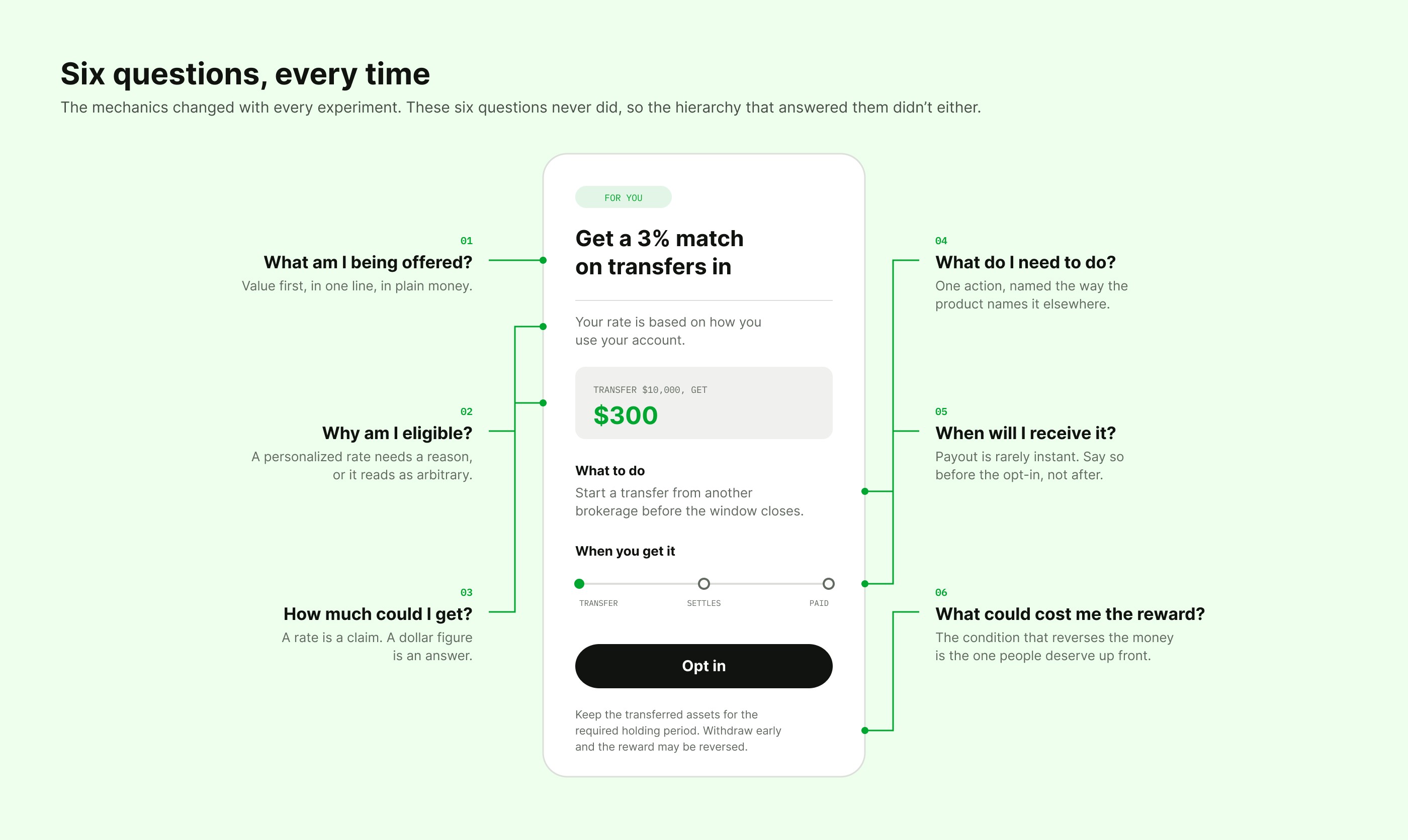
The mechanics changed constantly. The questions never did:

  • What am I being offered?

  • Why am I eligible?

  • What do I need to do?

  • How much could I receive?

  • When will I receive it?

  • What could cause me to lose it?


I gave those six questions a fixed hierarchy and let the answers change. The value goes first, in plain money rather than a percentage. The condition that could reverse the reward goes before the opt-in, not after it. Everything in between gets revealed at the moment it becomes relevant..


Keeping the complicated parts behind the scenes

The hardest part of this work was rarely the screen. It was translating business and regulatory logic into something a person could act on in ten seconds.

Personalized rates. Qualification windows. Reward tiers. Clawbacks. Account-specific eligibility. Each had to be communicated accurately, and each arrived with a partner who owned it — content, legal, compliance, engineering, CX. My job was to make the important conditions visible without letting the promotion collapse into fine print.

A good design here had to do two things that pull against each other: feel exciting enough to motivate action, and grounded enough that nobody was surprised later.


Building a toolkit instead of starting over every time

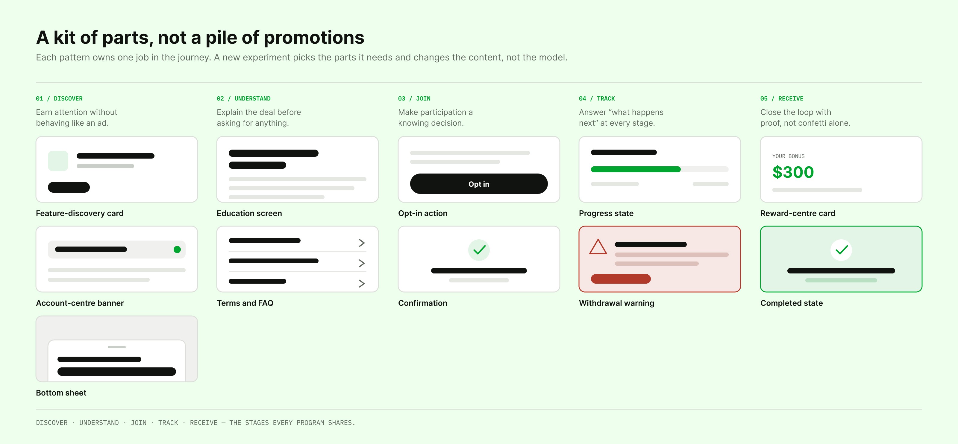
Because the programs shared a journey underneath, I stopped treating them as separate promotions and started treating them as a kit of parts.

Reusable structures for offer cards, education screens, opt-in states, progress messaging, reward details, and confirmation moments. Each pattern owns one job. A new experiment picks the parts it needs and changes the content, not the interaction model.

That's what made the pace survivable. It also meant a customer who saw two offers three weeks apart recognized the second one immediately.


The pace was a little different from a normal product team. There was always another experiment right behind the one we were finishing.


Moving from one experiment straight into the next

The team ran a tight loop: form a hypothesis, design the experience, align partners, prepare for launch, read the results, feed them into the next one.

I usually had three programs open at three different stages. One might be in final compliance review while another was still an open question about how the offer should be structured at all.

That pace forced a specific discipline: decide quickly, but never at the expense of the person on the other side of the screen.


Every offer was different. The experience couldn't be.

Some customers were offered a personalized match rate. Others qualified by depositing a certain amount, transferring an account, linking a bank, or simply finishing onboarding.

The mechanics changed constantly. The questions never did:

  • What am I being offered?

  • Why am I eligible?

  • What do I need to do?

  • How much could I receive?

  • When will I receive it?

  • What could cause me to lose it?


I gave those six questions a fixed hierarchy and let the answers change. The value goes first, in plain money rather than a percentage. The condition that could reverse the reward goes before the opt-in, not after it. Everything in between gets revealed at the moment it becomes relevant..


Keeping the complicated parts behind the scenes

The hardest part of this work was rarely the screen. It was translating business and regulatory logic into something a person could act on in ten seconds.

Personalized rates. Qualification windows. Reward tiers. Clawbacks. Account-specific eligibility. Each had to be communicated accurately, and each arrived with a partner who owned it — content, legal, compliance, engineering, CX. My job was to make the important conditions visible without letting the promotion collapse into fine print.

A good design here had to do two things that pull against each other: feel exciting enough to motivate action, and grounded enough that nobody was surprised later.


Building a toolkit instead of starting over every time

Because the programs shared a journey underneath, I stopped treating them as separate promotions and started treating them as a kit of parts.

Reusable structures for offer cards, education screens, opt-in states, progress messaging, reward details, and confirmation moments. Each pattern owns one job. A new experiment picks the parts it needs and changes the content, not the interaction model.

That's what made the pace survivable. It also meant a customer who saw two offers three weeks apart recognized the second one immediately.


Once the foundation was in place, I could apply the same thinking to very different offers without making any of them feel generic.


Helping customers notice an offer without making it feel like an ad

Entry points appeared across several parts of the app. Each had to earn attention while still behaving like part of the product.

I explored how much a customer needs at the point of discovery, what value to lead with, and when it's better to let the education screen do the explaining.

Two programs ran at once for part of the quarter, which turned into a genuine design question rather than a scheduling one: when someone is eligible for two offers, which one gets the card? We resolved it by ranking entry points by where the customer was in their journey, before linking a bank, one offer leads; after, the other does, so the app never argued with itself.


Giving people enough context to confidently opt in

Several experiments required customers to actively acknowledge the promotion before participating.

The education experience had to carry the value of the offer, the action required, the dates that mattered, and what could take the reward away, all before the opt-in. I used progressive disclosure to keep the primary screen approachable while keeping the full terms one tap away rather than one search away.

The personalized crypto experiment is the clearest example. It introduced an explicit opt-in alongside personalized match rates, specifically so that reward and clawback mechanics were acknowledged rather than assumed. The opt-in wasn't a friction we chose. It was a legal requirement, and the design work was making a required checkpoint feel like a fair one.


Supporting very different experiments without losing consistency

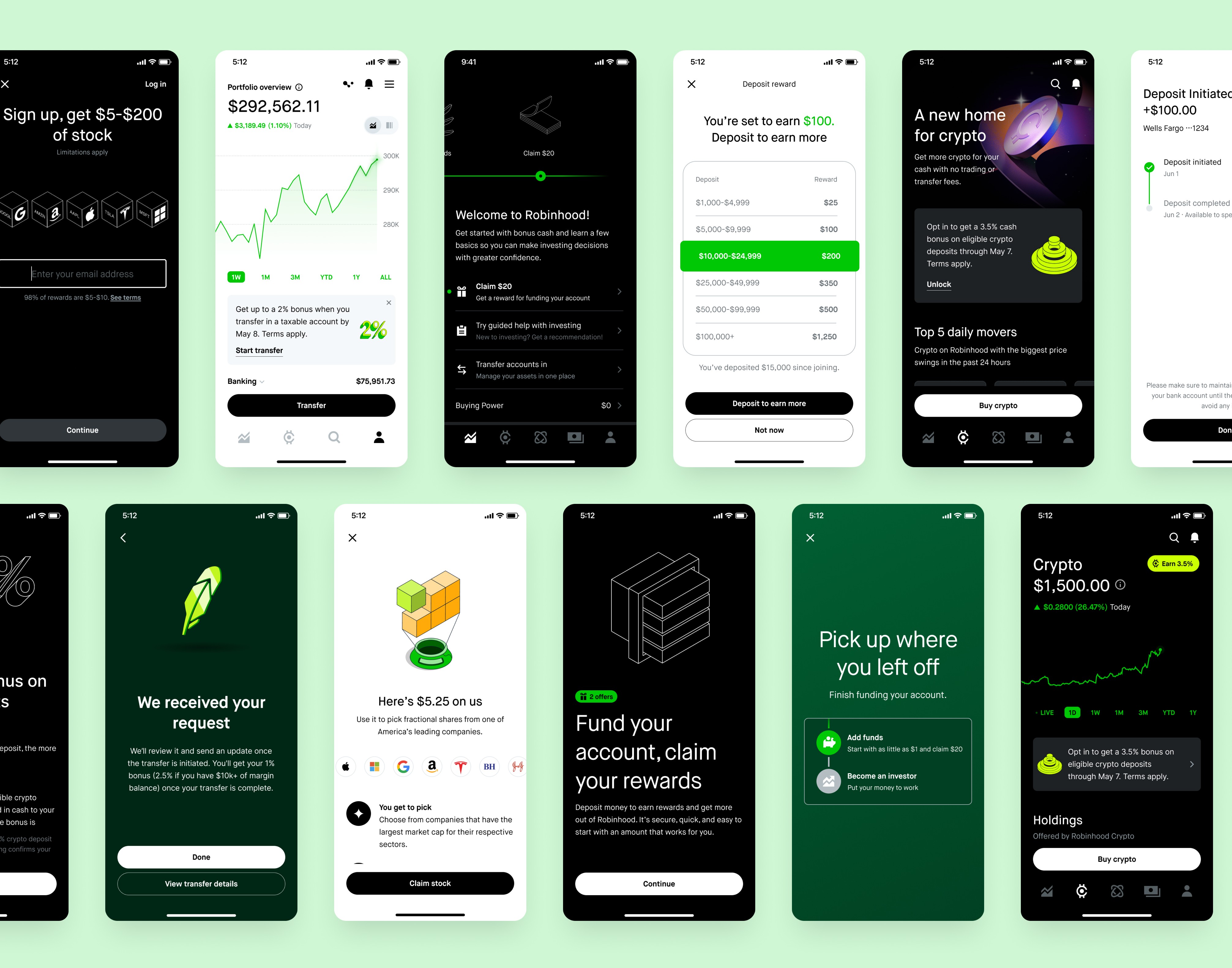
The final experiences spanned a wide range of actions, onboarding, linking an account, depositing cash, transferring investments, moving crypto.

Rather than presenting each program as its own case study, here's a selection showing how the same principles adapted across all four.


The real outcome wasn’t one final feature. It was creating a faster and more consistent way to keep experimenting.


Outcomes

Over three months I designed across four major incentive programs, worked with more than six partner disciplines, and supported experiences distributed across at least five customer-facing surfaces.

The work contributed to programs operating at significant scale, with prior versions generating eight- and nine-figure deposit impact. My work helped the team build on those learnings and continue exploring personalization, conversion, deposit growth, and payback.

Beyond any single promotion, I left behind reusable patterns that made the next experiment easier to design, easier to understand, and more consistent with everything around it.


The bigger outcome wasn't a feature. It was a faster, steadier way to keep experimenting.

PORTFOLIO

CHECK OUT SOME MORE

CHECK OUT SOME MORE

Product Update

Desktop & Mobile

Consumer Facing
Redesign

Desktop

B2B SaaS & Internal tools